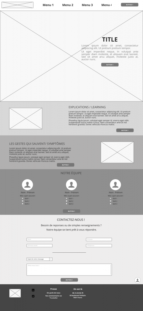
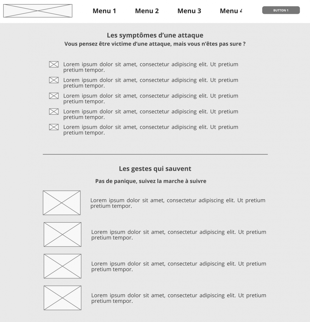
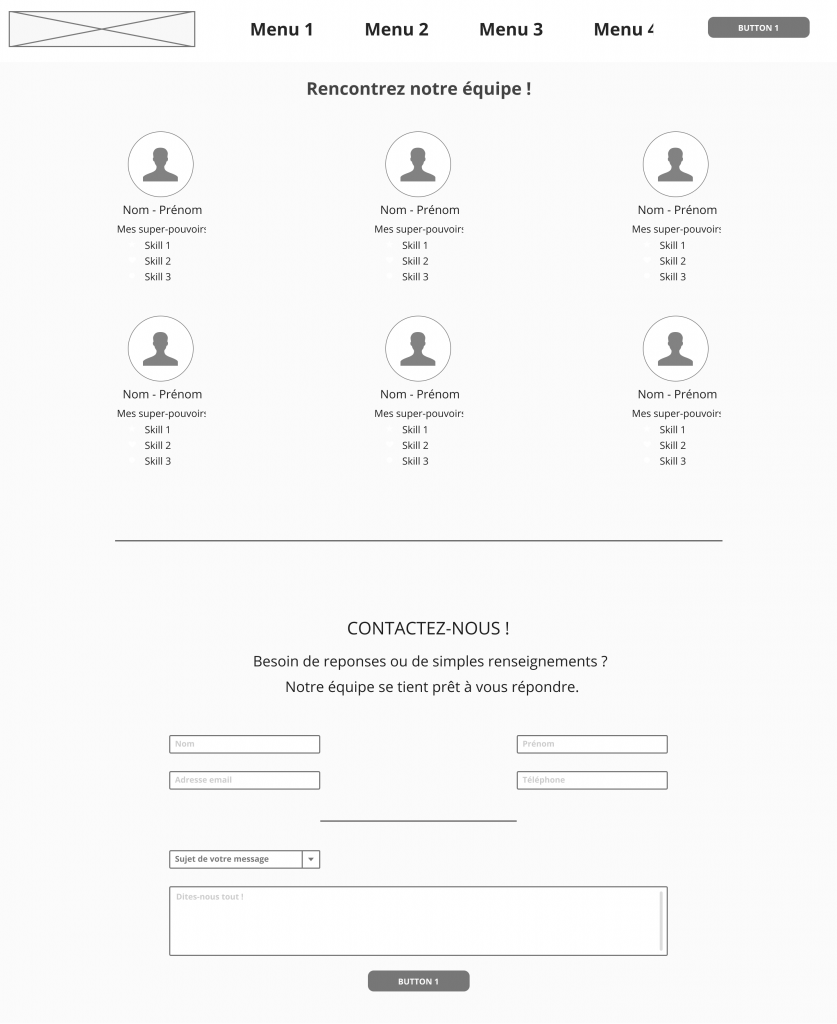
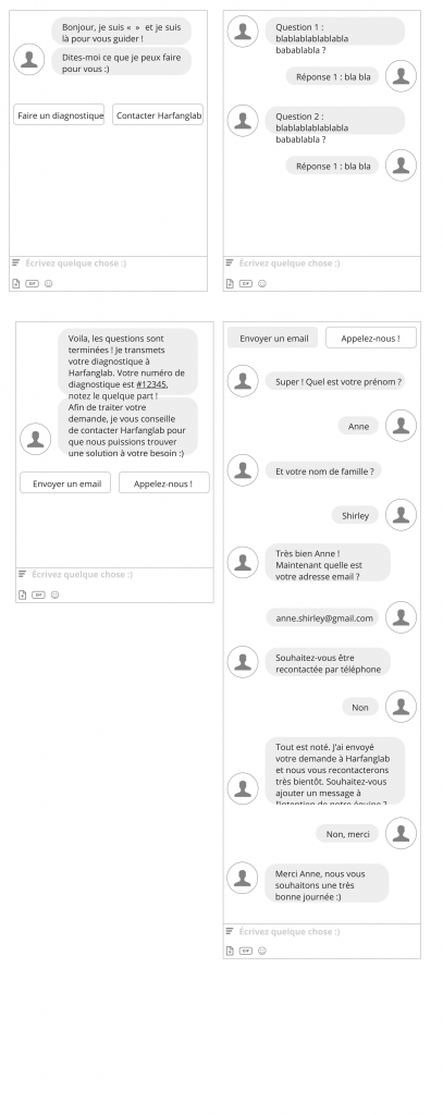
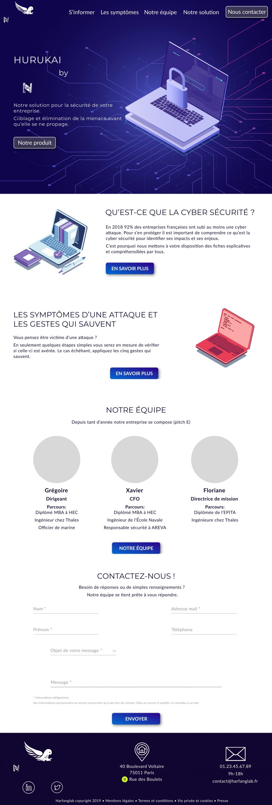
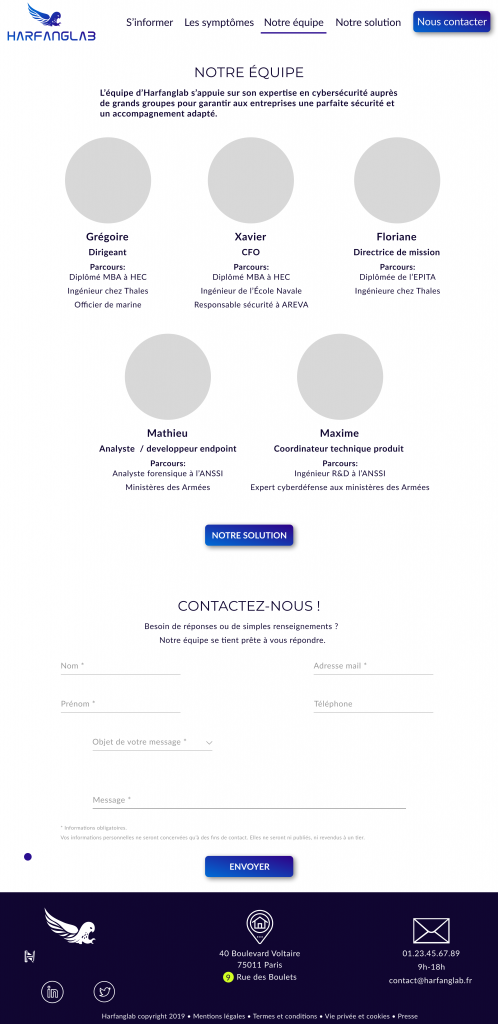
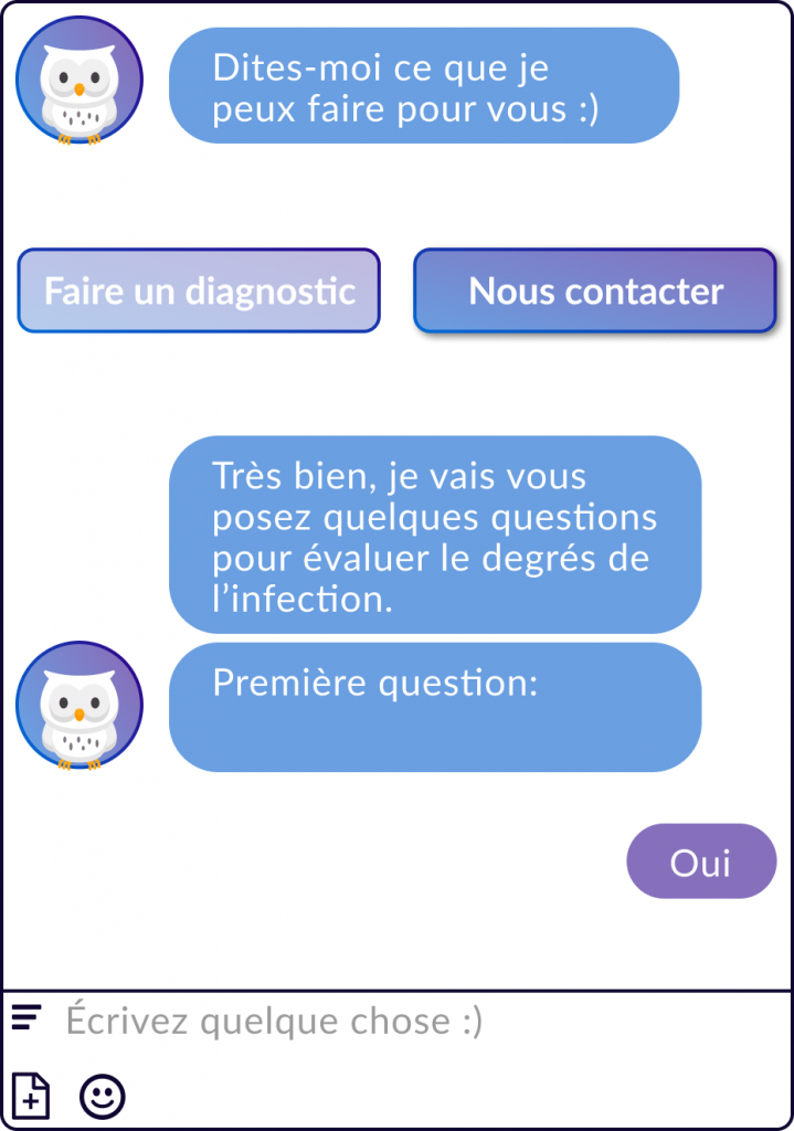
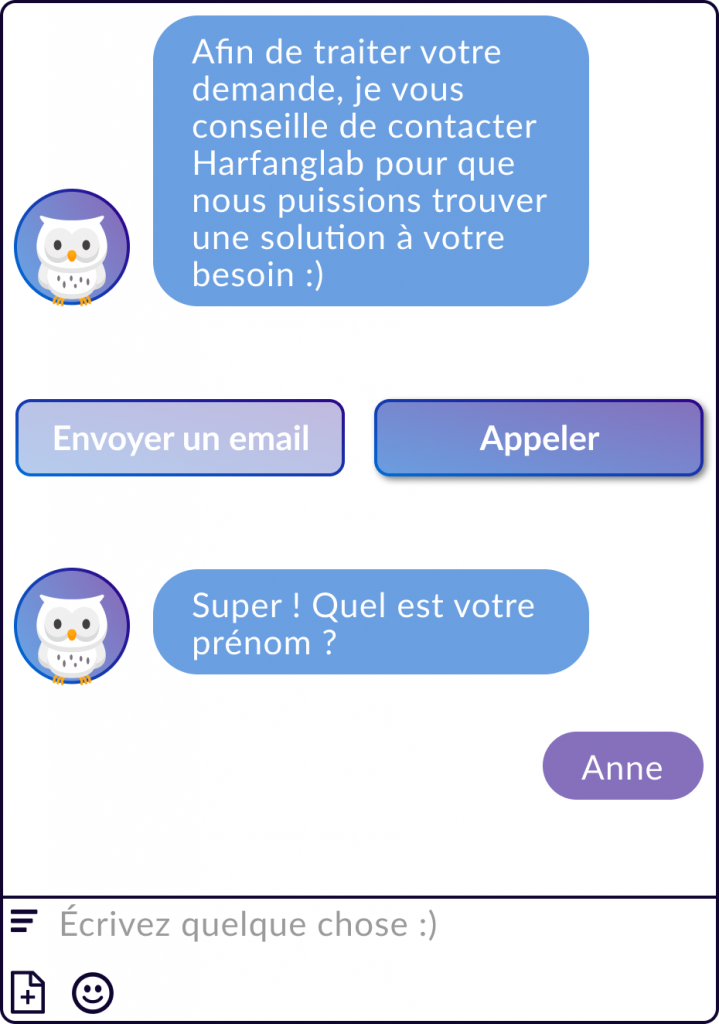
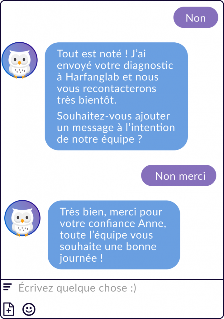
Les wireframes sont en français, car c’est une entreprise française. Cependant le projet à été fait et présenté en anglais.
Temps de réalisation: 2 semaines
UX/UI: Projet complet, UX et UI.
Note importante: Pour diverses raisons la cible utilisateurs ainsi que l’activité de l’entreprise Harfanglab seront légèrement différentes de mon projet.
The context
The main goal of this project was to help a company to improve its visibility and gain more clients. So I worked for Harfanglab, which is a cybersecurity society that helps to anticipate and block the attacks of cybercriminals for companies. They have created an EDR (Endpoint Detection and Response) to find and neutralize the danger.
Digging
I had an interview with the CFO and the mission director to ask what I could bring to their company and what are the major issues that encounter their users. I also interview five of their clients and the verdict is in: the website is unclear. Sometimes too much information and sometimes not enough.
Those insights were very interesting for me, but I needed a point of view from the outside. Knowing why there were very few new clients will be my next step.
Scary numbers
48%
rise in cyber-attacks in 2018
92%
of French companies were cyber-attacked
at least once in 2018
49%
of affected companies had
a significant impact on their business
Source: CESIN
(Club des Experts de la Sécurité de l’Information et du Numérique)
Interviews
Therefore, I have interviewed five more people, who are not Harfanglab’s clients. They owned a small company, often self-employed, well someone who doesn’t have an employee for web development or security in particular.
« I know nothing about cyber security.«
« I’m feeling anxious there is too much informations, and technical terms. »
« Other websites are too cold and distant. I’m feeling silly.«
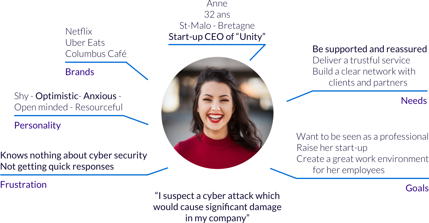
Persona
Problem statement
How Might We
Help Anne to find out if she has been attacked, and easily contact Harfanglab.
Crazy 8
I have found two persons, that have no skills in cybersecurity just like me, to do a crazy 8.
The guiding line: « You know nothing about cybersecurity, you need help and support, what could serve you ?«
Three ideas were standing out: a chatbot, a symptoms page with lifesaving technique, and another page with the presentation of the team/company.
Then we do a round-robin, to try to imagine how these ideas could look like, and share our different point of views.
Site map

The home page, the symptoms, our team and lifesaving technique are the pages I will be focus on for this project.
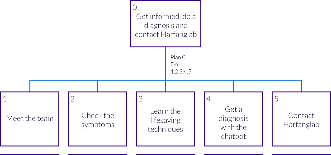
Task analysis
Mid-Fi wireframes
Moodboard

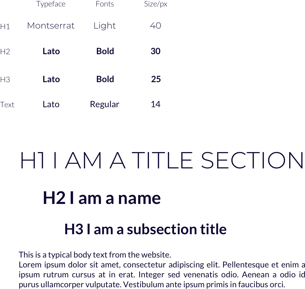
Typography
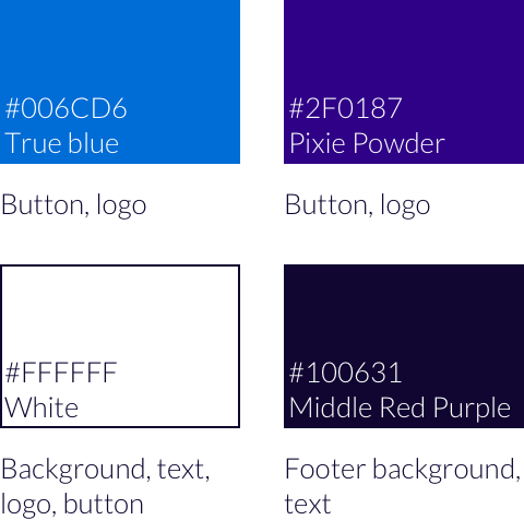
Colors
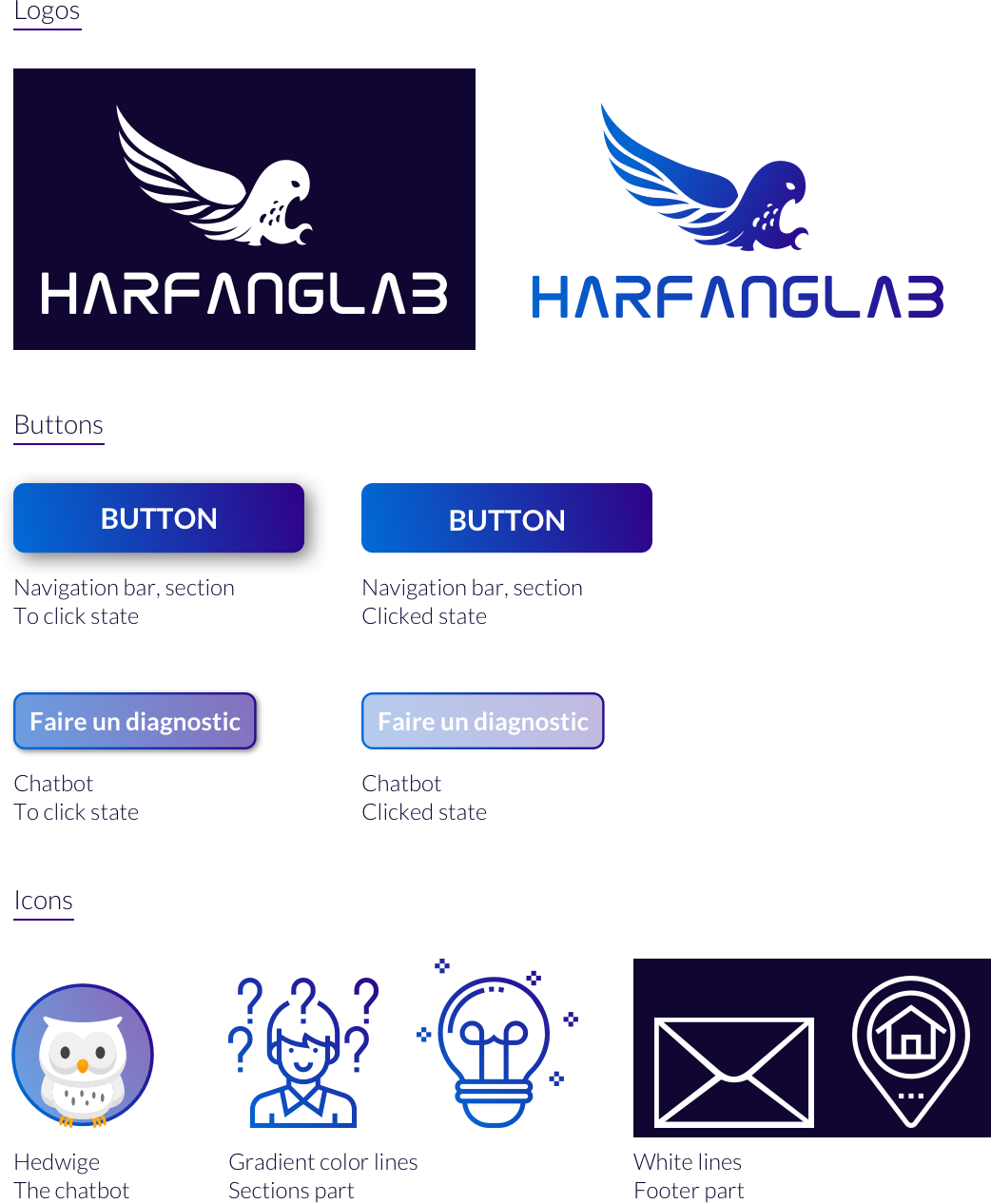
Iconography
Hi-Fi wireframes
Prototype
Réalisé avec Sketch et Adobe Xd
