Ce projet fut crée et expliqué en anglais.
Temps de réalisation : 1 semaine (design sprint)
UX / UI ? Il y a toujours de l’UX dans de l’UI, mais ici c’est avant tout un projet UI.
The context
The main goal of this project was to redesign a website into three steps: before, during and after an event.
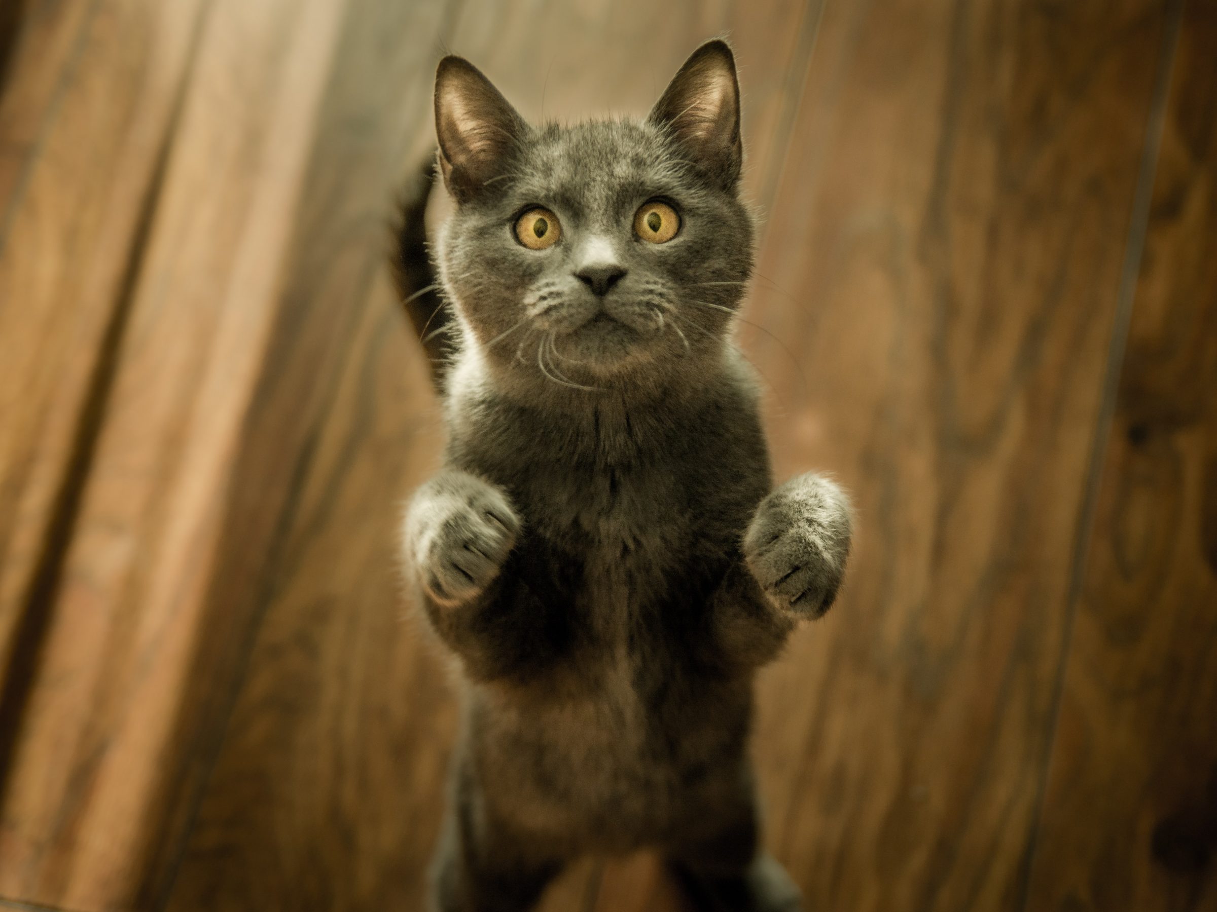
I have chosen Animal Expo, which is an annual exhibition where you can see and discover a lot of pets, watching shows and learning about their behavior with professionals. Moreover, you can adopt stray cats and dogs, which is for me the guideline of my project.
Adoption is a personal subject which I care, I don’t get how people can abandon their pets for holidays or when they didn’t want them anymore.
I also often help a friend of mine, which voluntary host stray cats and find them a new home, this is always the sweetest ones I have ever seen.
But now a lot of people prefer to pay a fortune to have pedigreed pets, because of their look, for more « likes » on Instagram (a short article about black cats).
I could talk for hours and hours about this topic, so I will stop and let you read my project !
So, here are my steps in details:
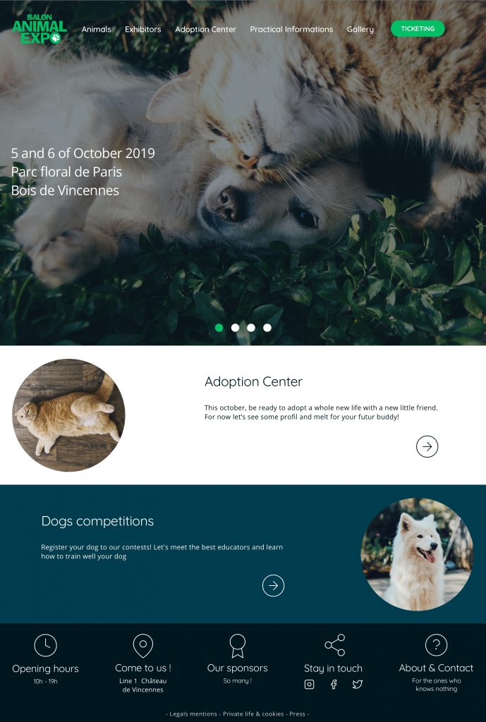
● Before the event
The user can see a few pets, with their profile page, that will be available for adoption at the event. The user is also allowed to contact the Adoption Center for more information or adoption throught a contact form.
● During the event
The flow is the same, but the user is now invited to go directly at the Adoption Center’s stand at the Animal Expo instead of the contact form.
● After the event
A new section appears, with pictures of all the pets that were adopted. And the profile pages of the ones who are still ready to be adopted.
We are the champions
Each year 100 000 abandonment of pet in France.
Including 60 000 in summer.
My holy mission
Redesign the actual website, for clearer information and promote the adoption center.
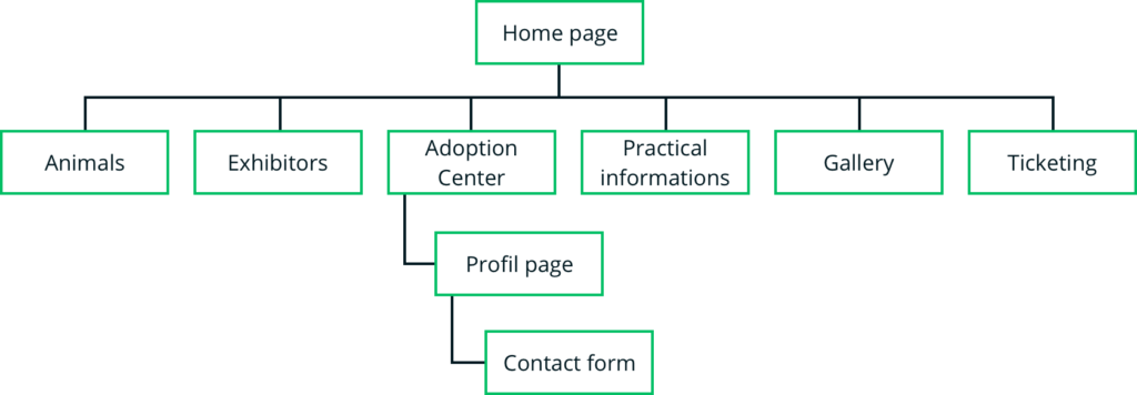
Site map
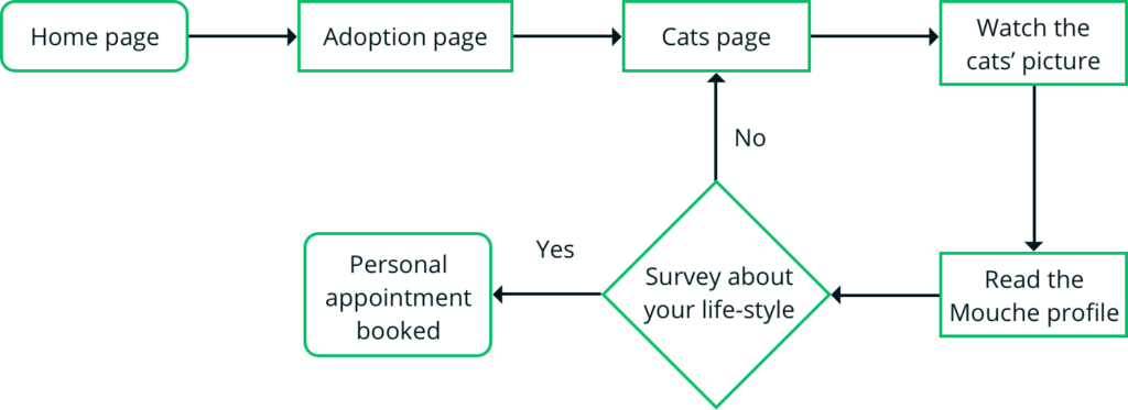
User flow
« I want to adopt a pet at Animal Expo! »
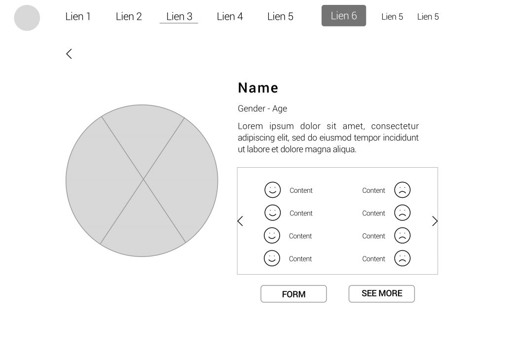
Mid-Fi Wireframes
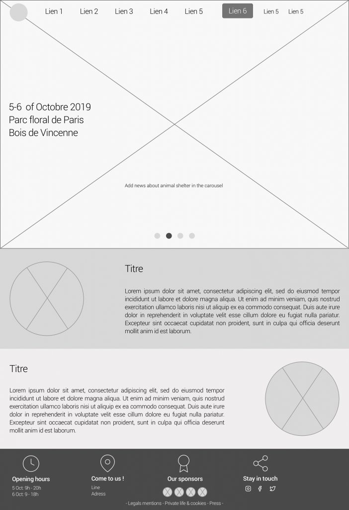
Why theses choices ?
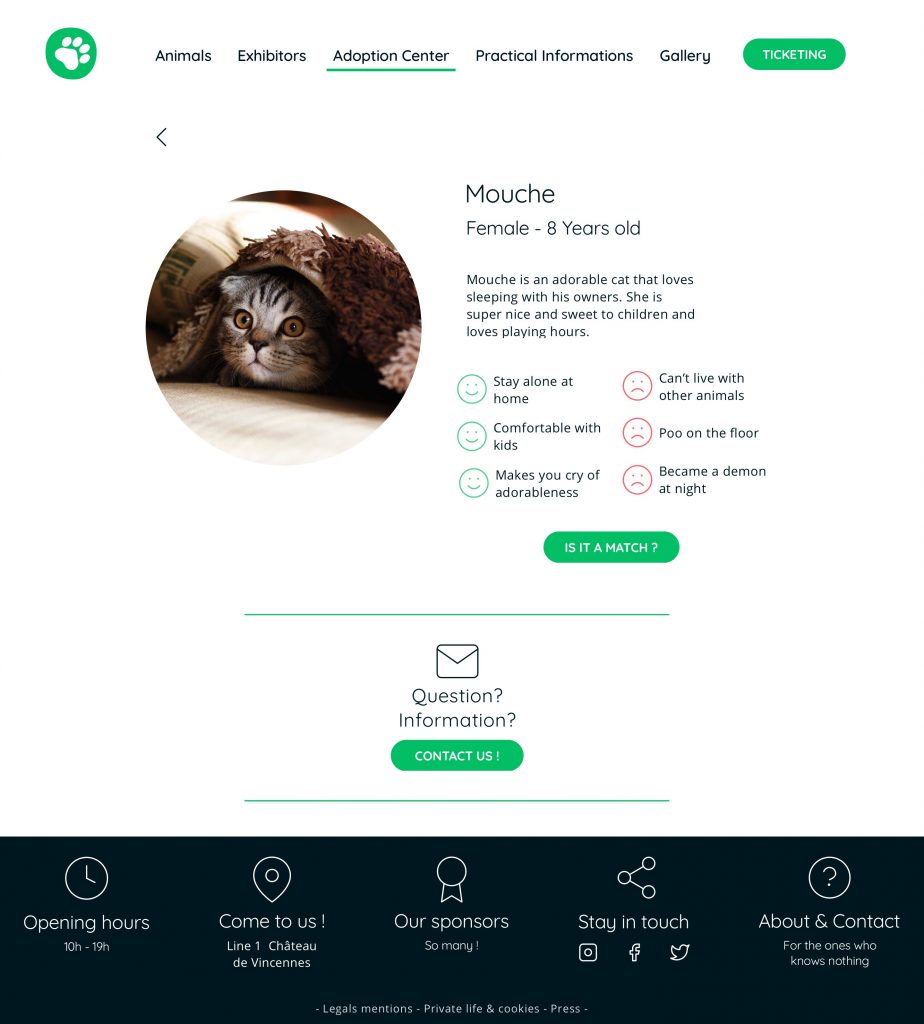
Adoption page
A few photos of animals, with age and gender, to be adopted.
A carousel to avoid an unpleasant scroll.
Profile page
The animal information is classified by do’s and don’ts and represented by smileys for an easy understanding. Ex: this cat is eased with kids, but dislike other cats company.
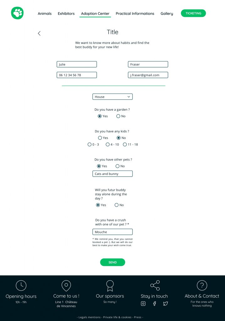
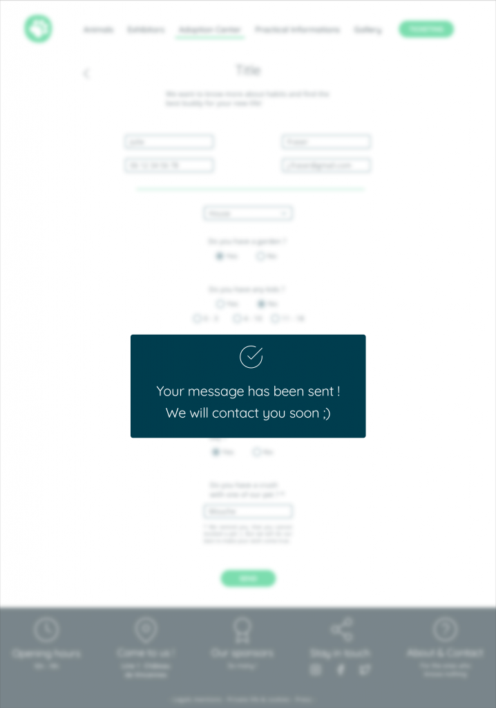
Contact form
Under the animal description, the user can click on a button to be redirected to a contact form. Indeed, the adoption center cares about the wellness of their animals, that’s why the center asks about the lifestyle of the future owner before an adoption. Will the animal stay alone during the day? Is there a garden? Even if the user has a crush on an animal, it’s a wiser decision to cares about his wellness rather than his looking.
After filling out the form, the adoption center will contact the user to tell if the animal will match the user’s environment and talk about the adoption.
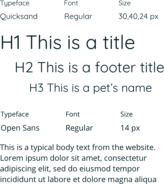
Typography
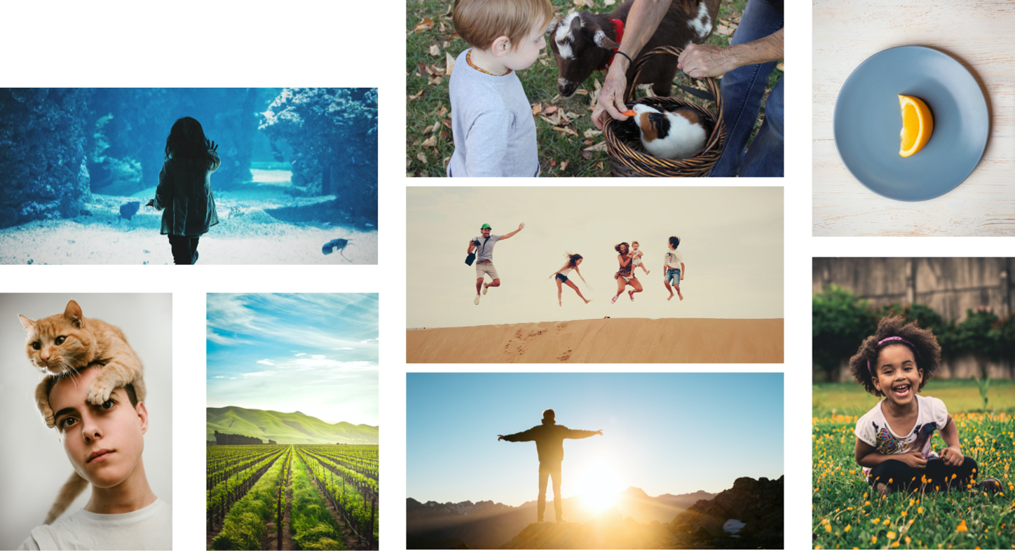
Moodboard
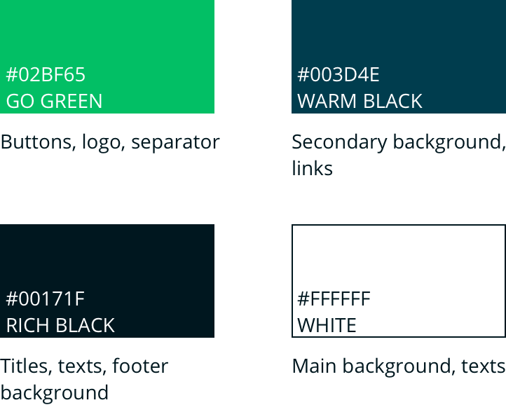
Colors
I kept the green and blue colors from the real website, I attenuated them for a contemporary look.
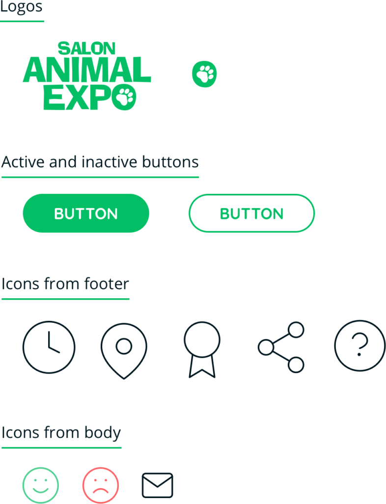
Iconography
Hi-Fi Wireframes
Prototype
Thank you
I hope my project could help, and remember : adopt, don’t buy !
Réalisé avec Sketch et Adobe Xd.