Ce projet à été initialement crée et expliqué en anglais.
Temps de réalisation : 1 semaine
UX / UI ? Ce fut à la base un projet d’UI, mais qui au finale m’a donné du travail côté UX.
The context
The main goal of this project was to add a new feature to an already existing application. At first, I would like to pick the Bitmoji app, because I find it really funny. But lunch with my friends at La Félicità will change everything, I didn’t know yet but my whole goal will be upside down [insert suspens and drama here].
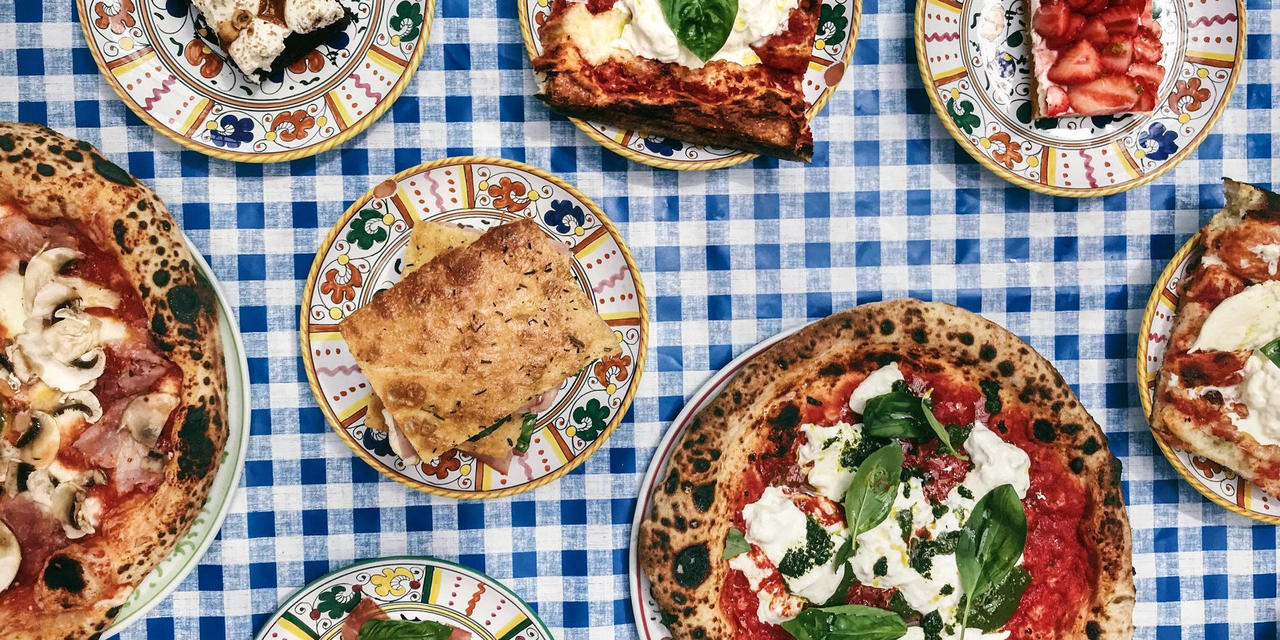
First, what is La Félicità ? From the Big Mama’s group, La Félicità is a big canteen like where you can order your meal from differents stands. To avoid the waiting time at the stands, the group creates an application to allowing users to order and buy food directly via their smartphone.
The problem
So, during this lunch, my friends and I would like to try this new app, barely install, the application causes us a lot of misunderstanding. We didn’t find what we want, and don’t understand what the application wants to our hungry souls.
Goodbye to my funny project with the Bitmoji app, I’m now with a real, big problem to solve. So I took my designer’s tools from my backpack, which is a clever mix between a psychologist’s notebook and shawl with a detective’s magnifying glass. Too bad, I only had my mobile phone and my eyeglasses, so I deal with it. I listened to my friends’ complaints, asked them why they didn’t reach their goal and also show me, in the application, what they don’t understand. It was my first users’ test.
« I don’t know where to go »
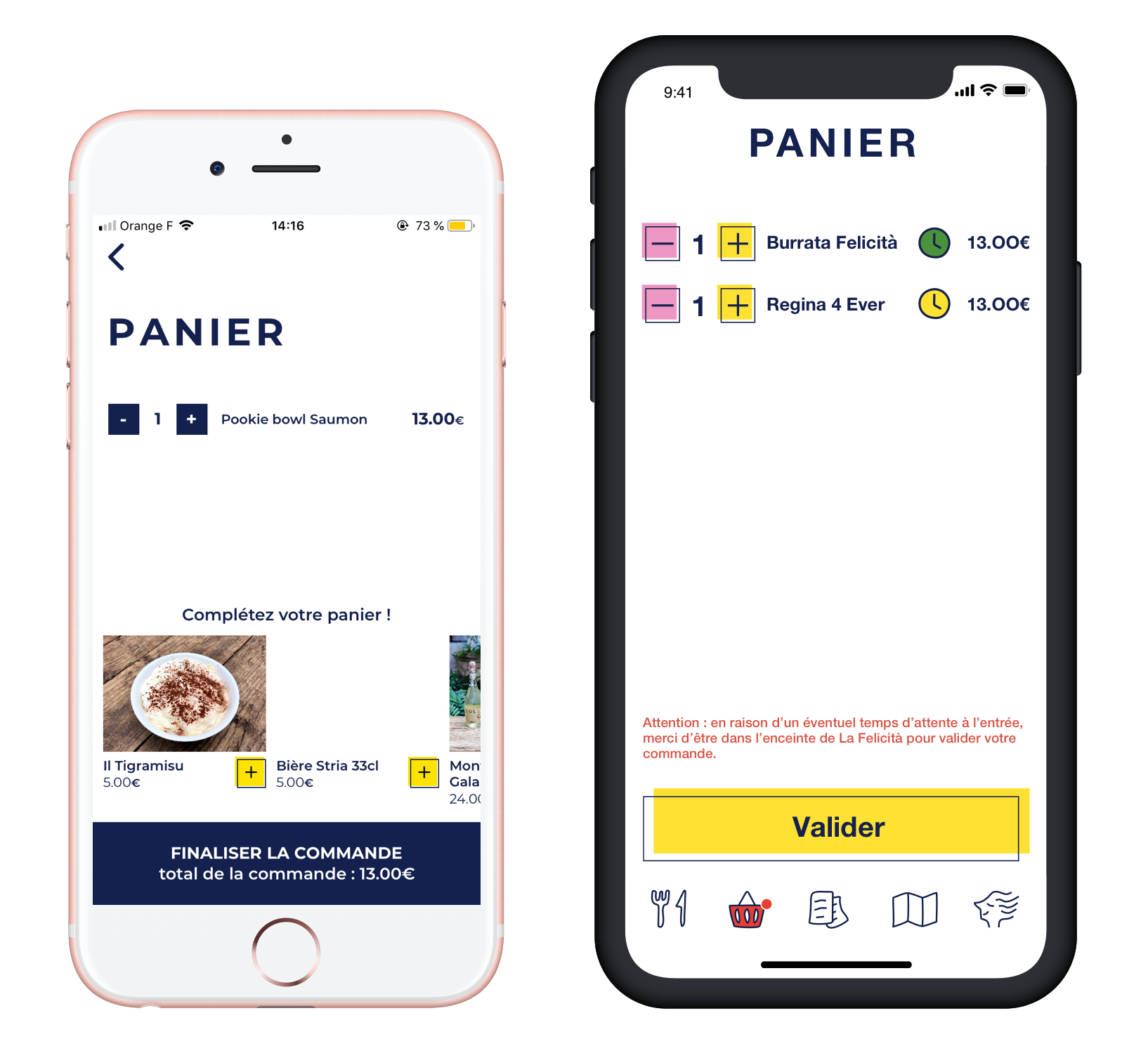
« I can’t buy in two different stands at once »
« Where are the drinks ? »
« It would have been faster if I moved by myself »
« I don’t understand the stands’ name »
So now, I have a lot of things to solve but mainly is to improve the buying process and to enrich the information’s signals. However, this project began to get off of my main goal which is adding a new feature. I decided to continue with La Félicità, even if I didn’t know where it will end. I wanted to solve those reals problems instead of adding a non-sense feature in a funny app.
My holy mission
How might we help
the users to easily find and pay for their meals ?
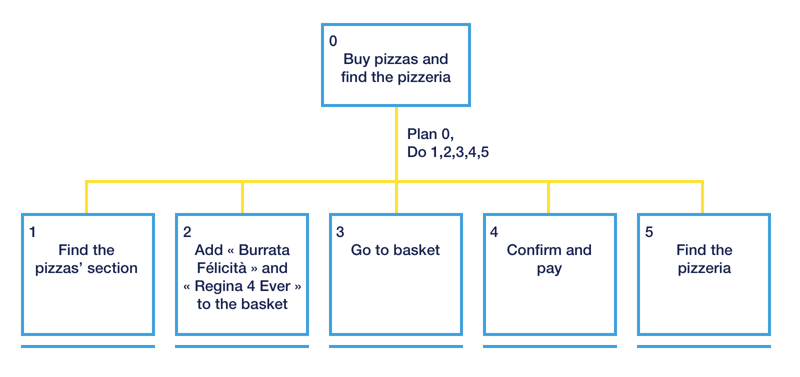
Task analysis
To answer my question and create a flow for my wireframes, I made a task analysis.
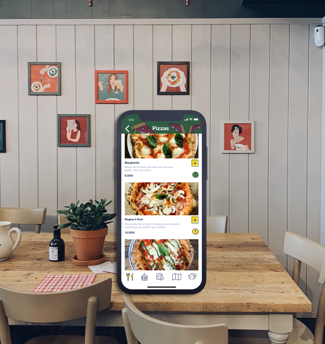
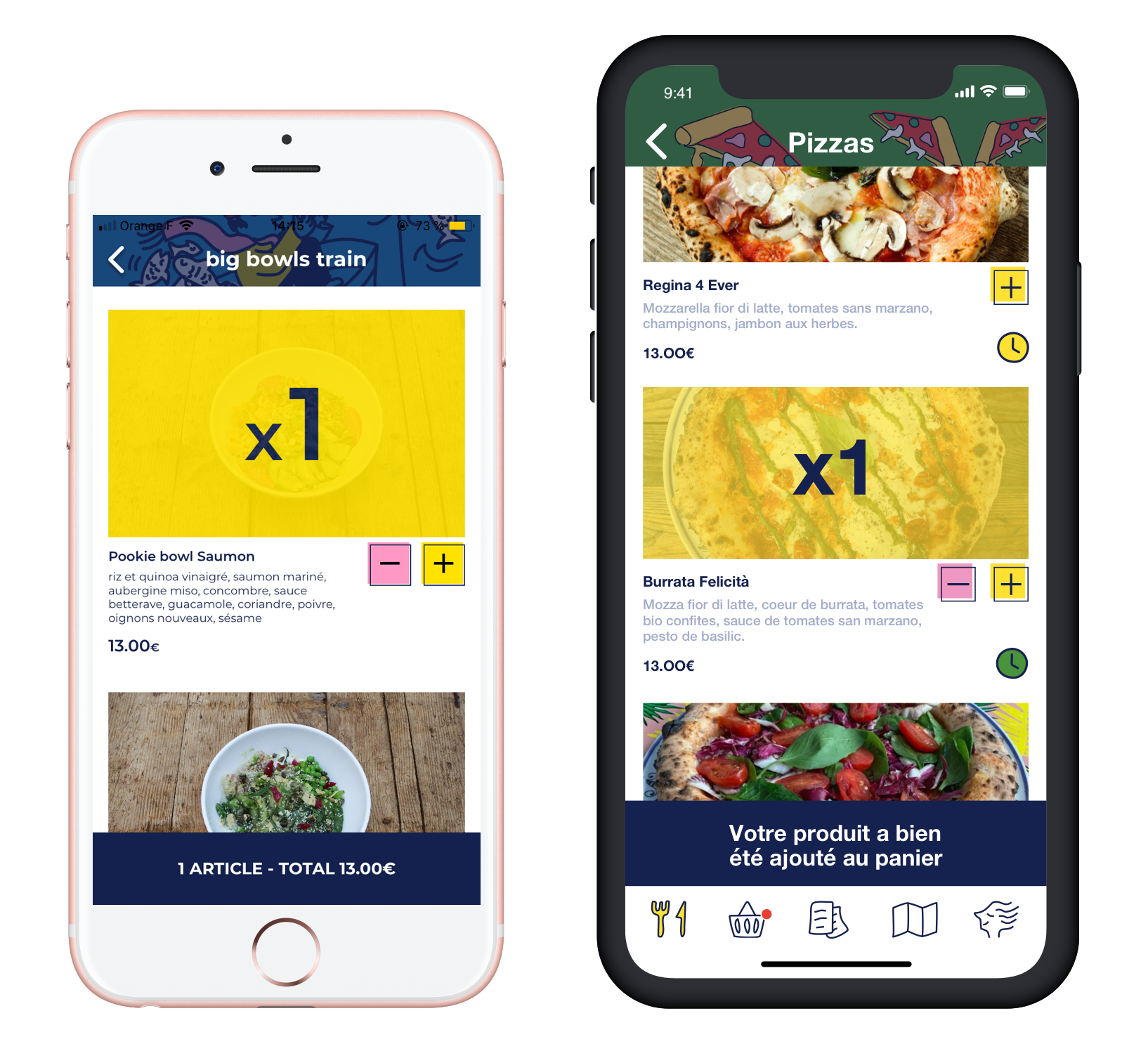
Low-Fi Wireframes

This is my very low-fi that helps me to visualize the future application. I tested it with 5 users. First I show them the actual one and asked them to order something and stroll in the app. Then I show them my low-fi and ask the same task. Well, it was better but I had to improve my wireframe more :
- I filtered by food products instead of stands, and users want to also keep the stands’ filter.
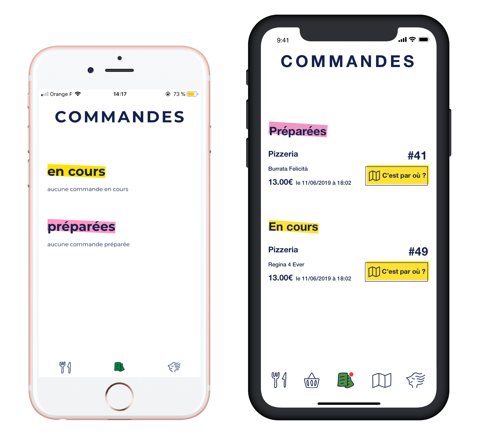
- They wanted to know if the order went well.
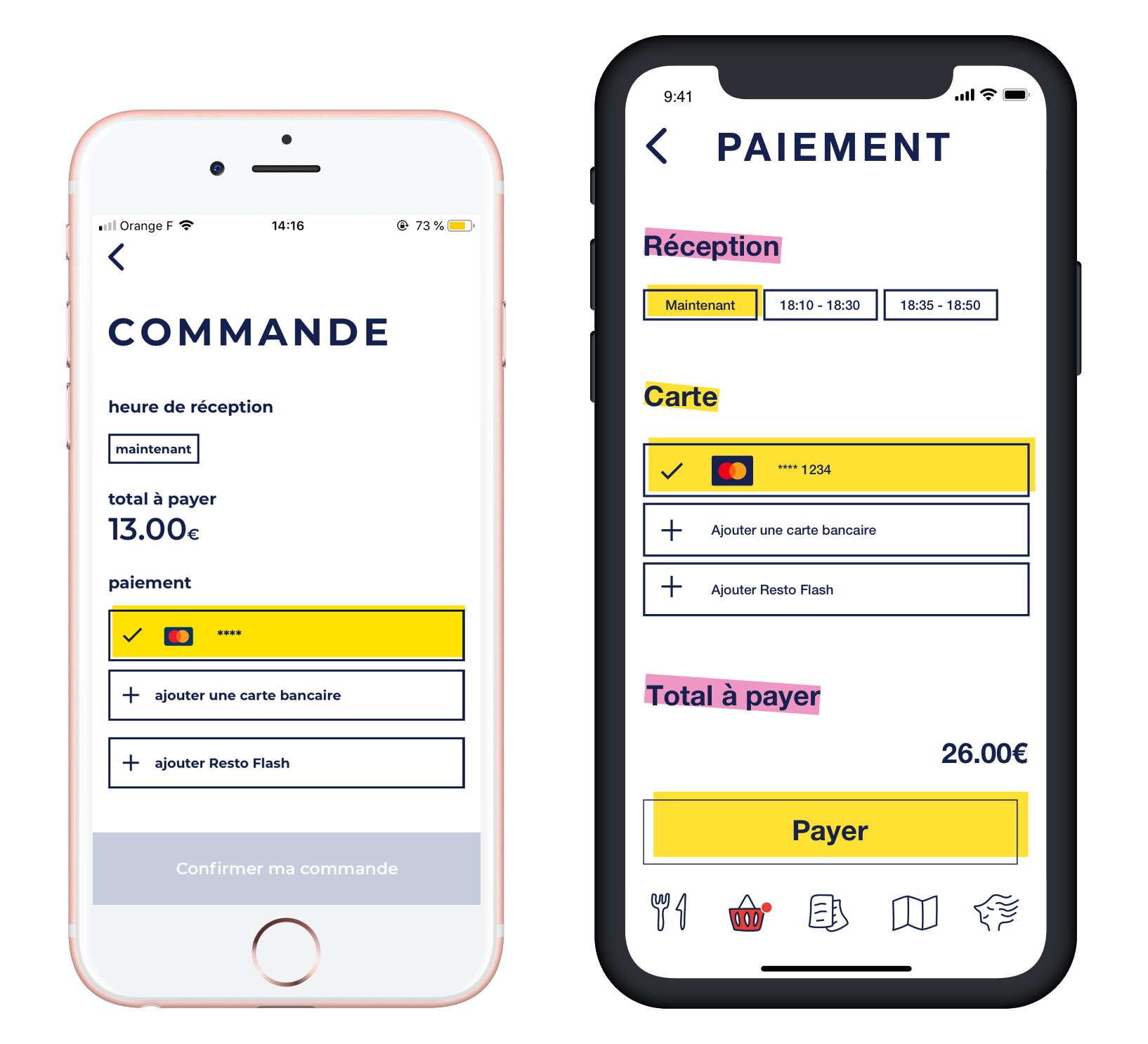
- They want to know how much time it will take for the pizza to be ready.
- I had more pages in the tap bar, and the order wasn’t logical for them.
- In the commands page, it would be clearer if the blocs « In progress » and « Ready » were reversed.
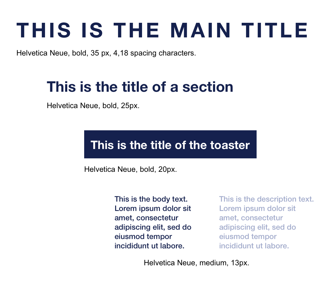
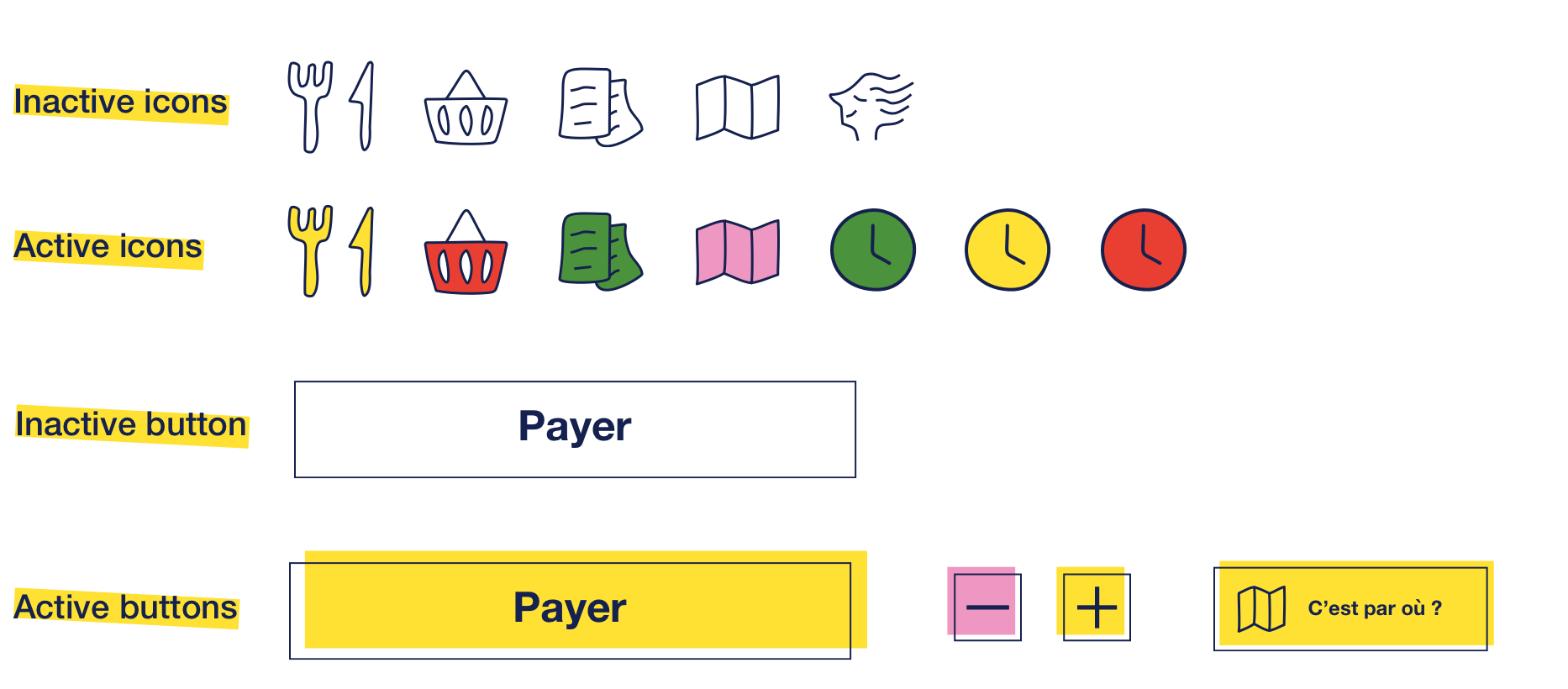
Typography
Colors
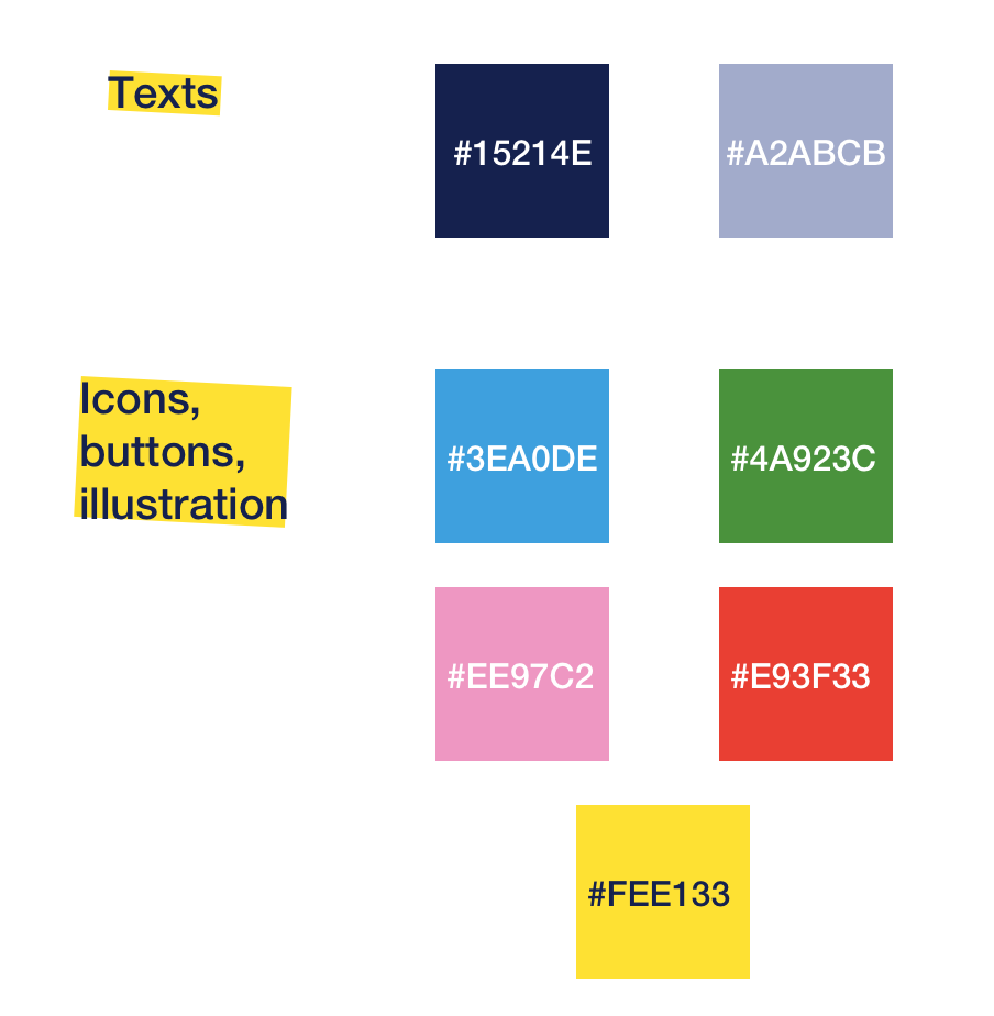
Iconography
The original ones are the cutlery, the papers and the face one. So I created all the others.
Hi-Fi wireframes
With all the elements from my atomic design and my mid-fi wireframe (that I won’t show you, because there is not a real impact for this article), I’m now ready to create all my hi-fi wireframes.
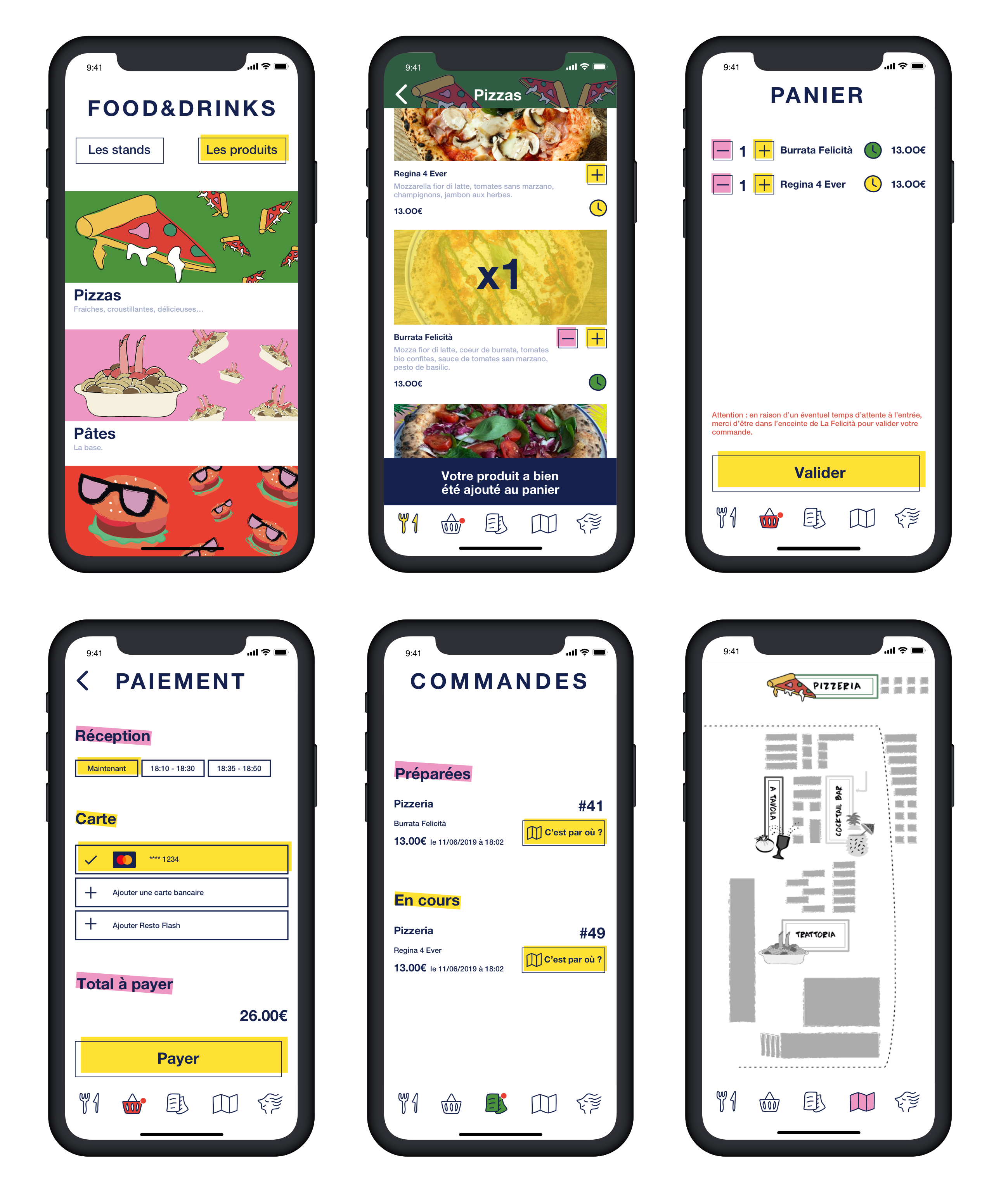
Prototype
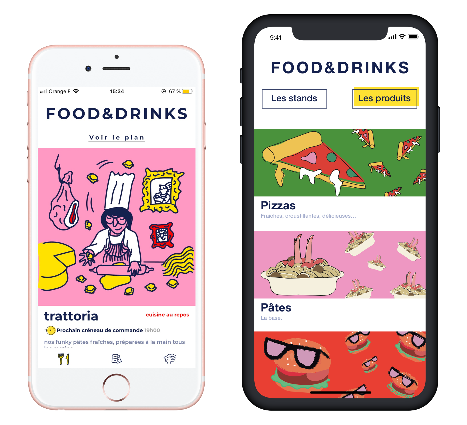
Before and after
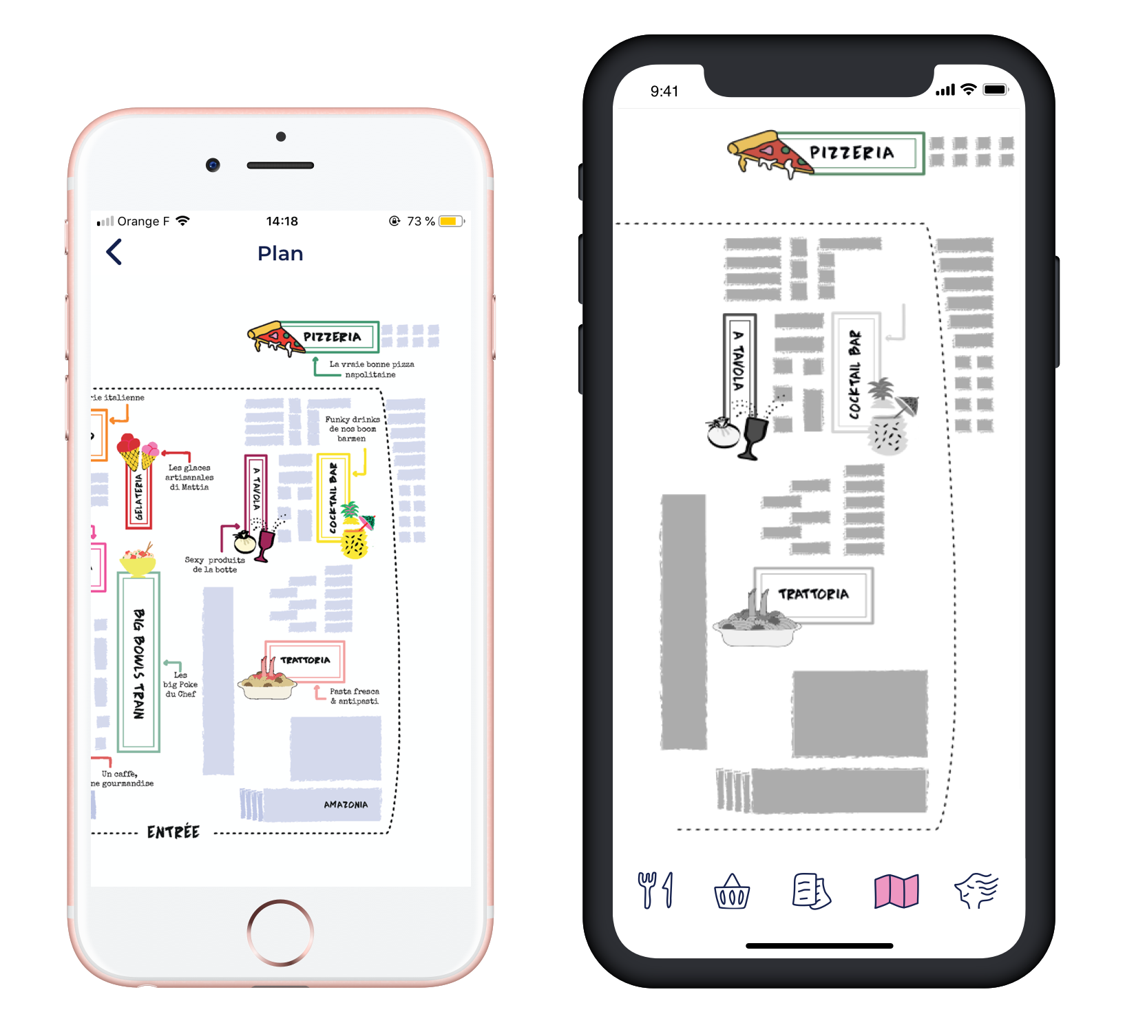
First, I would like to add some information to my UI choices. On the home page (first picture) I would have loved having the real illustrations because they are really nice and I wanted to keep the original design in my prototype. But I had no time to contact the artist for the illustrations’ doc. I tried to screenshot them via my mobile phone, but once in Sketch it was all pixelised.
So I find the map.pdf of the restaurant, full of little illustrations that I could use for this project. I had the same problem with the map (last picture), which is the real map.pdf. I would have preferred one specialized for mobile phone, with no scroll. But I have tried my best with that deadline.
Yay !
This is the end of my project, thank you for staying all long. I hope my work could help 🙂
And now I’m starving for pizzas…

Fait avec amour avec Sketch et Adobe Xd,
Cloé